Sign Design Tips
So you need to design a sign? Personal preference will go a long way when designing your sign, but there are also some things to consider that can improve the effectiveness of your sign design. This article will provide some sign design tips and touch on some common concerns that may not be obvious. Your sign probably has only a few seconds with its audience, so make them count!
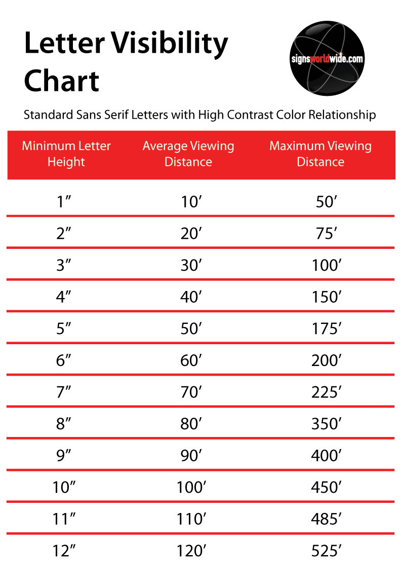
Letter Visibility:
Chances are you want your sign to convey a message (Coming Soon, Now Open, For Sale, etc.). One big concern in getting that message across is legibility. If the target audience can’t read it, your message will be lost. Prioritize your letter height according to message importance. Make the more important elements largest and the less important details smaller. You should also make sure your text height can be read at the intended viewing distance. The letter visibility chart below shows common letter heights with corresponding viewing distance.
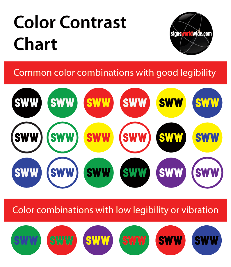
Color Contrast:
Another factor that impacts legibility is color contrast. Making sure your text can be read against the background color is another key component to an effective sign. Some background colors can be too dark and others can be too similar in value to the text. Extreme dark against extreme light work best (think black and white). You want your message to pop! Refer to the color contrast chart for some common color relationships.
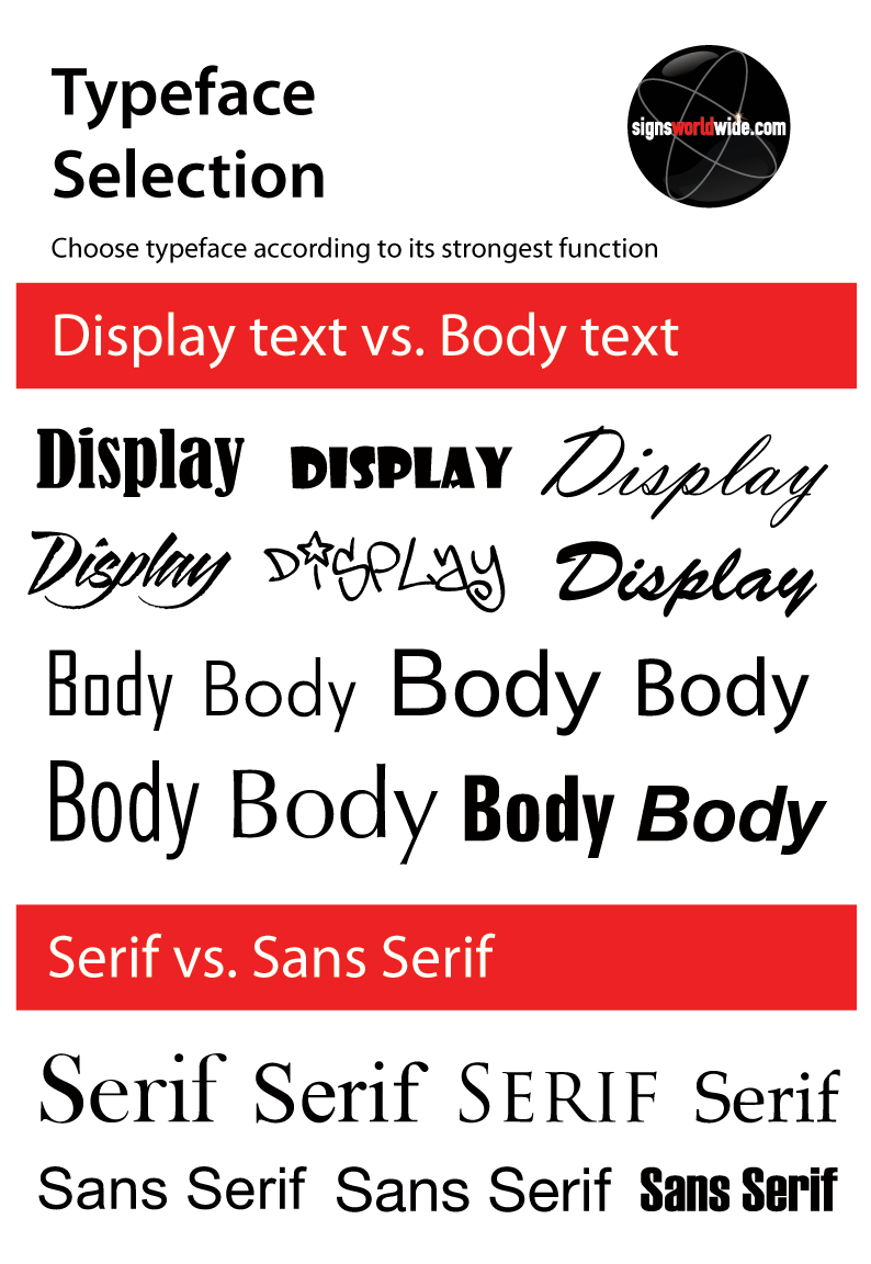
Typeface selection:
The typeface chosen for your sign is very important. You want something that gets the viewers attention and allows for an easy read. Many signs only have a few seconds of viewing before the viewer drives or walks away. That means careful planning on your part for maximum impact. Limit your typeface usage to one or two with a maximum of three. Good sign design doesn’t require a bunch of fonts and in reality, juggling a large number of typefaces successfully is quite difficult. Your sign should have some type of “display/decorative” typeface that will grab the viewers attention and then a “body” typeface that will allow the message to be easily read. Refer to the typeface selection graphic for more detail. Fonts with decorative elements (serifs, script, graphic elements, etc.) tend to be harder to read. Save those to grab attention and choose a more simple font (sans serif) for the major message. Choose a typeface that has multiple versions of itself (light, regular, bold, black, condensed, italic, etc.) so you can make your sign interesting without making it gaudy or hard to read.
Positive/Negative space:
Your message will likely represent the positive space on the sign while the background will be the negative space. Take care to leave some negative space, the air around your message, so the text can “breathe.” Stretching text to the outermost points on your sign will increase letter height, but will also choke the negative space; this will lower the visibility factor significantly.
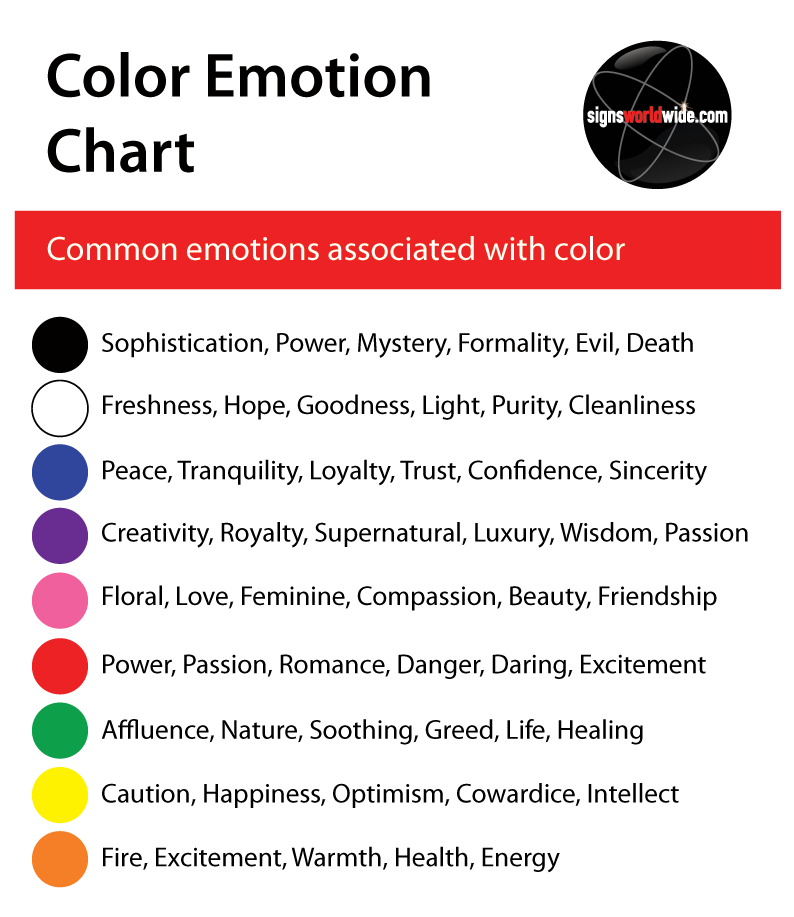
Color Emotion:
Color emotion? This one may be a little more subtle than the other concerns, but it does have some value. Colors often have emotional traits that can impact your audience in a positive or negative way. Refer to the color emotion chart to see some common emotional reactions to color.
Are you starting to feel more comfortable with sign design? Hopefully this article has you pointed in the right direction. As always, SignsWorldWide is ready to assist with free sign design if you run into trouble!

