Signs that Save Lives

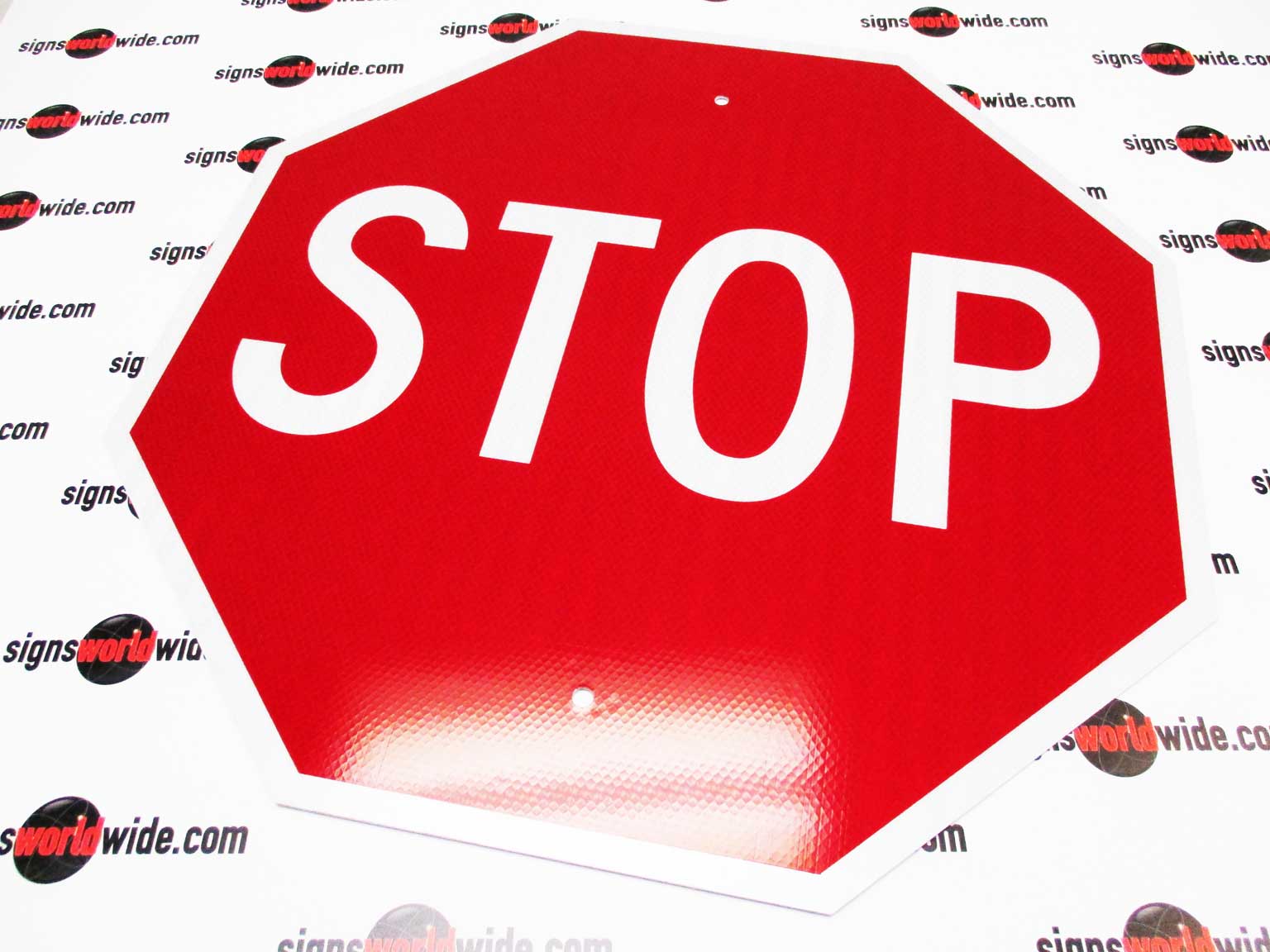
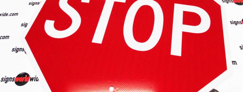
Ok, so that title probably got your attention, but you may be wondering, how can a sign really save a life? It’s simple; take traffic signs for example. An improper or missing traffic sign at an intersection can be catastrophic. It’s easy to take for granted what a simple Stop sign is installed to do; until one is missing and two unsuspecting cars collide. Take a second and web search a phrase like “missing stop sign causes accident” and see how many results pop up. Maybe in your case the sign isn’t missing, but instead it is old or non-reflective in a dark setting with poor visibility. If you happen to be in a property management situation and have improper or ineffective signage on your property you may be held responsible for injuries or damages should an accident occur.

SWW-Safety-Signs

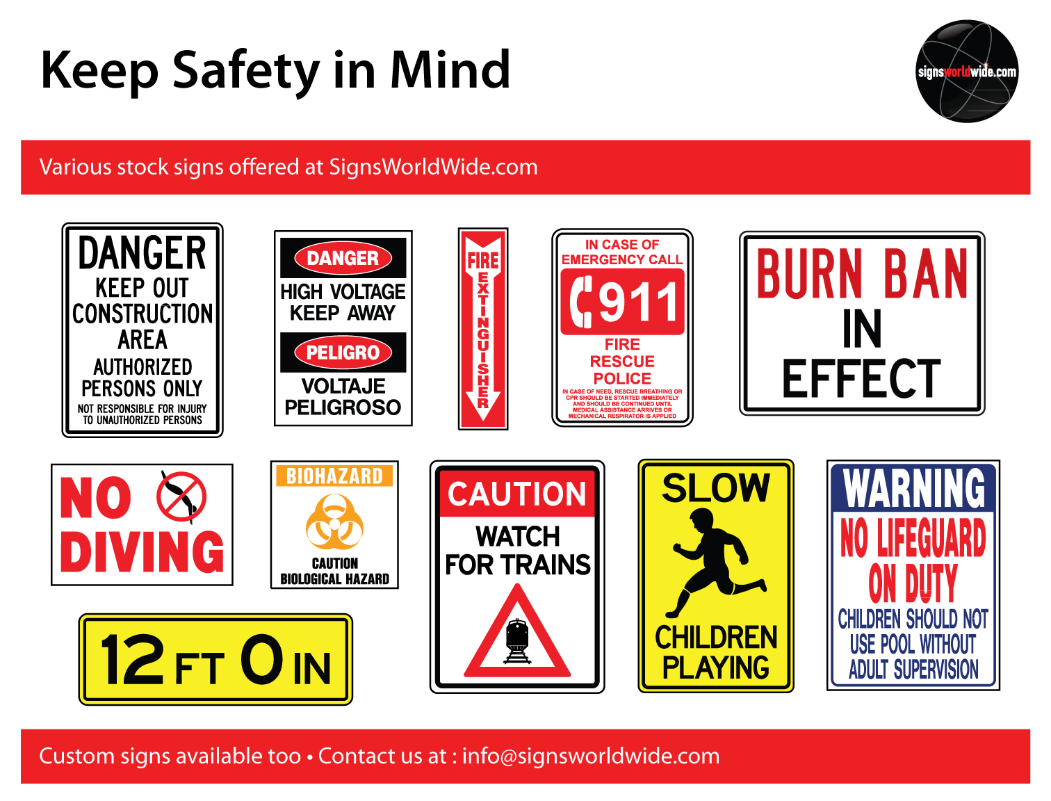
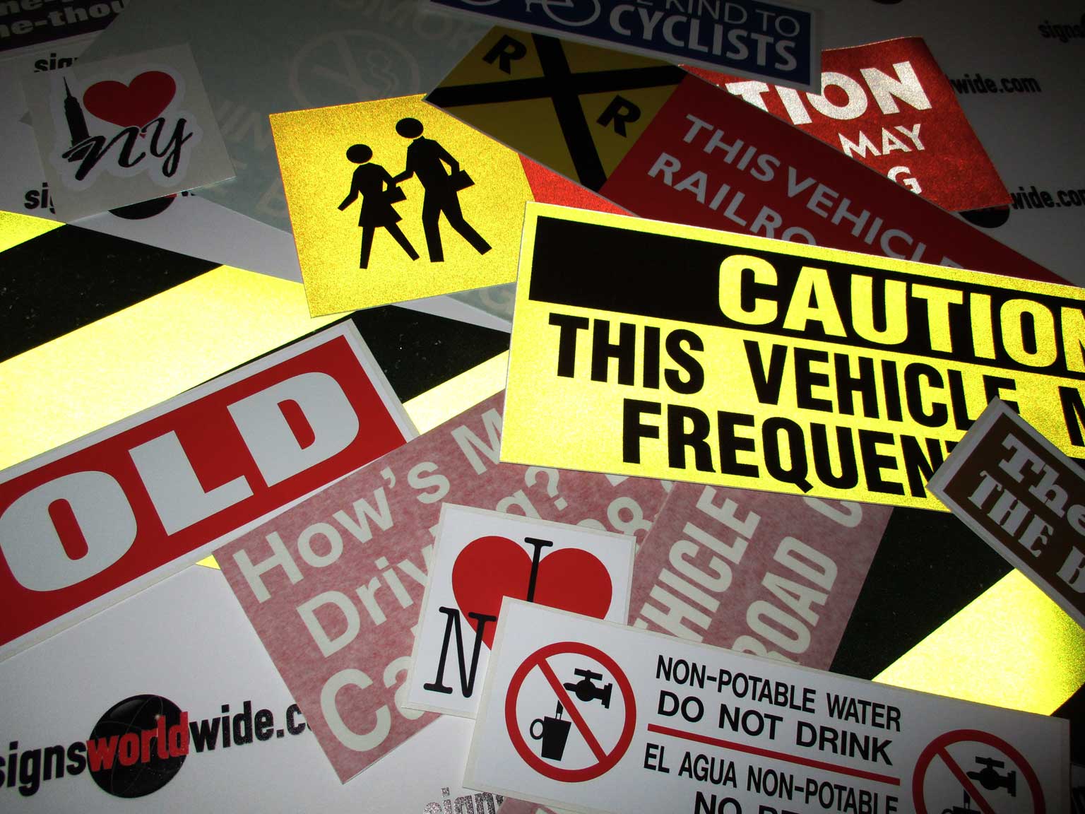
The same can be said for safety signs inside other urban settings. Some believe that signs mentioning “high voltage” or “Caution” are put in place to avoid OSHA penalties alone, but they do much more to curtail dangerous situations than they are given credit for. Yes, placing a “No Diving” sign near a community swimming pool can help your company avoid unwanted fines, but more importantly they can help inform the unaware of potential dangers. Some of the most satisfying socially-positive changes are the ones we may never become aware of because they were done right before things went wrong.

Take a minute and survey your surroundings. Are there ways that signs can improve or make things safer around you? Browse our stock safety signs under “Sign Categories – Traffic/Safety Signs” to see if anything applies to your situation. What should you do if you don’t see what you were looking for? Contact SignsWorldWide and let us know what you need. We offer free sign design and competitive pricing on all types of signs. Thanks for reading – Stay Safe!

SWW-Stop-signs-HI-reflective

Decals

Decals

Have a surface that needs a message attached? It might be a good job for the trusty decal!
Inexpensive and durable, decals have become a sign staple for small scale advertising.

Decals, also known as stickers, are a thin vinyl film with an adhesive backing. The decals come attached to a backing paper that keeps the adhesive clean until you are ready to apply it (think bumper sticker).

Some decals will be a printed image on a rectangle while others will be die cut into individual pieces.

SWW-Cut-vs-Print-front

SWW-Cut-vs-Print-back

The die cut decals will come with a temporary “transfer tape” that keep the vinyl decals aligned while it is applied to the desired surface. Once the decal has been applied, the transfer tape can be removed leaving only the individual decals behind (Refer to our Blog on “vinyl application instructions” for more information on vinyl installation). You may also receive larger one piece decals with transfer tape as well. Larger decals can be difficult for inexperienced users to install. The transfer tape will keep the decal stiff while it is being applied. As in the die cut decals, the transfer tape can safely be removed once it has been successfully applied.

Opaque White vs. Reflective

Most decals will be an opaque white, but reflective is an option as well. If you need your message to be seen at night, reflective vinyl decals are a good choice. Light from headlights or other ambient sources will reflect off of the metallic particles inside the decal and make your message stand out well against the dark area surrounding the decal.

SWW-Decals-Reflecting

SignsWorldWide offers many stock decal options along with the ability to customize or create any decal you may need. Feel free to contact us regarding your project so we can help get your message stuck!

Don’t forget about our FREE SHIPPING offer currently going on for all decal orders.

Magnetic Signs

Magnetic Signs

Who doesn’t love a good magnet right? They are inexpensive. Their changeable nature gives them flexibility not available with other types of signs. Visible when needed and easily tucked away when unwanted. Below are a few quick notes about magnetic signs you may not be aware of along with some tips on storing and caring for magnetic signs.

Magnetic Product

SignsWorldWide uses an .030 magnetic sheeting material with a thin white PVC vinyl face. We have found the .030 material to be both strong enough to cling to most surfaces and flexible enough to fit casual contours. It’s flexible nature comes in especially handy on vehicle doors. Our magnetics are printed with a UV solvent ink that has great outdoor durability and will give your magnetic sign the ability to put in years of advertising service.

Magnetic Care

If your magnetic sign gets dirty, they can be cleaned with mild soap and water. Avoid using harsh chemicals or solvents as these can damage the graphics. Take time to clean the magnetic front and back. Keeping the back of the magnetic free from debris will help its magnetic properties. When the magnetic is not needed, store it on a flat surface so that all of its edges are flat. If the edges are stored on an uneven surface they can become wavy which would allow air to get behind them and lift the magnetic up. If you notice the edges are not laying flat, take a hot hair dryer or heat gun and gently warm the area so it lays flat again. Keep the heat source moving as to not overheat the magnetic and damage it. Tip: Storing them on a refrigerator works great!

SWW-Curved-magnetic

SWW-Heating-magnetic

SWW-Flat-magnetic

Magnetic Installation

Installing your magnetic on a vehicle is a breeze. Pick the largest available flat spot and visually align the magnetic to the longest straight element of your vehicle. Hold the magnetic close to the vehicle surface and let the magnetic grab the surface. Keep in mind that magnetics will ONLY work with steel and work best on flat surfaces. The magnetic should NOT be installed over body moldings or dimensional elements. Some vehicles are made from plastics and other metals, which will not work with magnetic signage. For these vehicles, consider buying vinyl graphics and applying those directly to the vehicles surface.

Feel free to contact us with any questions or concerns regarding magnetic signage. Have a good day!

Don’t forget about our FREE SHIPPING offer currently going on for all magnetic sign orders.

Vector Artwork

Have you heard the term “vector artwork” and are not quite sure what it means? Vector artwork comes up frequently when dealing with signs and large scale design projects. While vector art can look very similar to the more common bitmap file format, it has special traits that give it more flexibility when increasing file size. The nature of the vector format allows artwork to be enlarged to theoretical infinity without losing quality.

Vector art consists of points and lines instead of pixels as found in bitmap images. These points and lines are not constricted like pixels are. How can you tell them apart if they look so similar at first glance?

Image-1

If you have a vector file in a graphics application, like Adobe Illustrator, you can select the artwork with the “selection tool” and the vector artwork will show all of the points and lines where as the bitmap image will only show a box around the artwork with an X across it.

Image-2

Increasing the size on both of these files will begin to highlight why vector artwork is so desirable. At 600% you can see how the text in the bitmap image is beginning to show its individual pixels.

Image-3

At 2400% you can really see the pixels.

Image-4

Compare that with the vector file at 2400%.

Image-5

So you may be thinking, yes that looks great; so how do I get vector art? The best way is to create your artwork from the beginning in a graphics application that supports vector formats (Adobe Illustrator , CorelDraw, etc.). You can always “rasterize” the vector artwork into a bitmap file, for use on the web for example, but it is very difficult to go the other way and create vector artwork from a bitmap file. In this case, the bitmap file will usually need to be recreated from scratch in a vector application.

This is only the beginning of vector artworks magic, but hopefully you know a little more know than you did before reading this article.

Should you need any help with artwork, such as a bitmap to vector artwork conversion, SignsWorldWide has a full service design department capable of handling it. We can also assist with additional questions not covered in this article.

Thanks for reading!

Sign Design Tips

So you need to design a sign? Personal preference will go a long way when designing your sign, but there are also some things to consider that can improve the effectiveness of your sign design. This article will provide some sign design tips and touch on some common concerns that may not be obvious. Your sign probably has only a few seconds with its audience, so make them count!

Letter Visibility:

Chances are you want your sign to convey a message (Coming Soon, Now Open, For Sale, etc.). One big concern in getting that message across is legibility. If the target audience can’t read it, your message will be lost. Prioritize your letter height according to message importance. Make the more important elements largest and the less important details smaller. You should also make sure your text height can be read at the intended viewing distance. The letter visibility chart below shows common letter heights with corresponding viewing distance.

SWW-Letter-Visibility-Chart

Color Contrast:

Another factor that impacts legibility is color contrast. Making sure your text can be read against the background color is another key component to an effective sign. Some background colors can be too dark and others can be too similar in value to the text. Extreme dark against extreme light work best (think black and white). You want your message to pop! Refer to the color contrast chart for some common color relationships.

SWW-Color-Contrast-Chart

Typeface selection:

The typeface chosen for your sign is very important. You want something that gets the viewers attention and allows for an easy read. Many signs only have a few seconds of viewing before the viewer drives or walks away. That means careful planning on your part for maximum impact. Limit your typeface usage to one or two with a maximum of three. Good sign design doesn’t require a bunch of fonts and in reality, juggling a large number of typefaces successfully is quite difficult. Your sign should have some type of “display/decorative” typeface that will grab the viewers attention and then a “body” typeface that will allow the message to be easily read. Refer to the typeface selection graphic for more detail. Fonts with decorative elements (serifs, script, graphic elements, etc.) tend to be harder to read. Save those to grab attention and choose a more simple font (sans serif) for the major message. Choose a typeface that has multiple versions of itself (light, regular, bold, black, condensed, italic, etc.) so you can make your sign interesting without making it gaudy or hard to read.

SWW-Typeface-selection

Positive/Negative space:

Your message will likely represent the positive space on the sign while the background will be the negative space. Take care to leave some negative space, the air around your message, so the text can “breathe.” Stretching text to the outermost points on your sign will increase letter height, but will also choke the negative space; this will lower the visibility factor significantly.

Color Emotion:

Color emotion? This one may be a little more subtle than the other concerns, but it does have some value. Colors often have emotional traits that can impact your audience in a positive or negative way. Refer to the color emotion chart to see some common emotional reactions to color.

SWW-Color-Emotion-Chart

Are you starting to feel more comfortable with sign design? Hopefully this article has you pointed in the right direction. As always, SignsWorldWide is ready to assist with free sign design if you run into trouble!